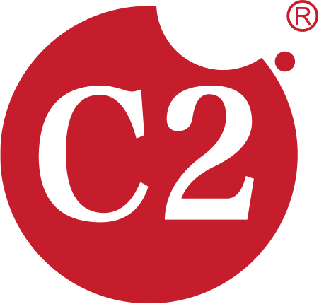

Based on a concise circle, the logo symbolizes the completeness and purity of the product. With ingenuity, the founder integrated a notch on the edge of the circle, cleverly creating a strong visual hammer of "a bitten cookie". Against the high-contrast red and white color scheme, this design is highly recognizable and memorable, vividly echoing the cookie-eating scenario and directly conveying the brand's advocated concepts of deliciousness, interaction and fun.